|
|
|
|
#1 |
|
Участник
|
powerobjects: Visualizing Data in Dynamics 365
Источник: https://www.powerobjects.com/2018/01...-dynamics-365/
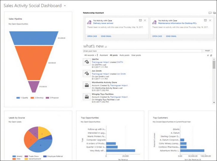
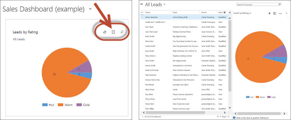
==============  In the fast-moving digital world that we live in, communication is a crucial skill. It is incredibly important that information can be conveyed efficiently and be guaranteed to stick with the recipient. The real question is, how do we convey our information and data in exciting and intuitive ways? Studies by The Social Sciences Research Network show that around 65% of the population are visual based learners. This means that a considerable percentage of your users won’t get the most out of your solution if you’re presenting them with statistics and spreadsheets. Thankfully Dynamics 365 has features to help you visualize your information, whether built in or provided by PowerObjects through our PowerPack add-ons. Let’s walk through a few different ways that you can visualize your data and explain how they can benefit you. Dashboards and Charts For many organizations, dashboards are what many of your end users will be seeing and interacting with on a daily basis. Dashboards are a customizable and shareable collection of key charts, views, iframes, and graphics to show key performance indicators to make accessing and understanding your data easier.  Above is an example of a typical dashboard, containing a mix of charts and the relationship assistant feature. At a glance, end users can quickly get a feel for the information that is important to them. Specific dashboards can be assigned and shared with users or a team with relevant roles, such as salespeople or service agents.  Individual components, such as charts, can be drilled down into to further explore and analyze the data, revealing the records behind the component. This is also known as inline visualization and can be accessed using the button highlighted above. By utilizing dashboards your end users can move from a high level overview of information relevant to them that are displayed using charts and other visualisations, into specific records to understand their data at a deeper level. If you would like a more in depth look at dashboards and their components then follow this link to PowerObjects’ The CRM Book. Power BI Power BI is a suite of business analytics tools that allow deeper insights into your data throughout your organization. Power BI can be used to produce graphics and charts for use in dashboards and reports, which can be viewed on multiple platforms. Much like charts and views, Power BI tiles can also be embedded into Dynamics 365 dashboards. This means that users no longer need to navigate to Power BI to utilize its analytical tools and can use them from within Dynamics 365. After being embedded into a dashboard, Power BI tiles can be interacted with and drilled down into in a similar fashion to Dynamics 365 dashboard components. Note that to utilize Power BI you must have a Power BI Office 365 subscription and need to enable Power BI embedding within your Dynamics 365 System Settings. Below is an example of a Power BI dashboard, and the same tiles embedded into a Dynamics 365 dashboard.  If you would like to know more about connecting your Dynamics 365 data with Power BI then follow this link to our PowerObjects Blog. PowerMap PowerMap is an add-on developed by PowerObjects; you can find further details and installation instructions for PowerMap here. PowerMap allows you to choose an entity, choose a view for that entity, and to plot all the records of that entity onto a map in Dynamics 365. This add-on can be useful to any organization that needs to display the geographical locations of records and their location relative to one another, such as contractors or facilities. PowerMap even has a built in heat map feature to allow you to see set radiuses around records or concentrations of records in an area. Let’s have a quick overview of some of the features of PowerMap and how they help to visualise your data. Keep in mind that in order for records to be mapped they must have a valid address – if they do not then they can’t be mapped! 1. Visual mapping and differentiation of records The basic functionality of PowerMap allows users to map records from any entity as long as they have a valid address, and to differentiate between records from different entities. Records can be differentiated by assigning them with pins of different colors and types, as well as using other graphics that are specific to the type of record, such as contacts or leads. PowerMap allows users at a glance to see the geographical spread of their records, and what type of record they are. Below we can see an example of PowerMap mapping various records (left) and the various types of pins and graphics available. In this example, accounts are mapped with a red pin, contacts with a yellow pin, and leads with a blue pin.   2. Heat Maps PowerMap includes a built in heat map feature, to allow you to create a heat map for any mapped entities. The heat map allows you to see concentrations of mapped records in an area, and can also be used to show an operational radius or area around a record. The colour gradient, intensity, and radius of the heat map can be customized, and several heat maps can be applied at the same time. Below is an example of what a heat map may look like, in this case when applied to Account records (left). Also displayed is the color gradient options available, and the intensity and radius (miles), all of which can be modified (middle and right).  3. Directions By utilizing Bing Maps, PowerMap can also provide users with detailed directions, from one address to another. This can be accessed by users within your system on multiple platforms, and can be especially useful for field agents. Below is an example of what PowerMap directions may look like.  If you would like to know more about PowerMap, or any of our other PowerPack add-ons then follow this link. Hopefully this blog has provided you with a few ideas on how to better connect with your users and present your information in a more visual way. Be sure to subscribe to our blog so you have immediate updates to all of the new tips and tricks for Microsoft Dynamics 365, and if you would like more in-depth information on any CRM topic check out our CRM Book! Happy Dynamics 365’ing! Источник: https://www.powerobjects.com/2018/01...-dynamics-365/
__________________
Расскажите о новых и интересных блогах по Microsoft Dynamics, напишите личное сообщение администратору. |
|
|
|
|
| Опции темы | Поиск в этой теме |
| Опции просмотра | |
|