
|
|
|
|
#1 |
|
Участник
|
powerobjects: Python Starter in Power BI Desktop
Источник: https://www.powerobjects.com/2018/10...er-bi-desktop/
==============  Python is finally supported in Power BI Desktop in August 2018 Updates (preview)! Many Power BI fans are excited about this new feature in Power BI Desktop. Let’s get started and try it out! This post is intended to be a Python starter in Power BI Desktop. Our goal is to set up and create “My First” Python visual in Power BI Desktop. Before diving in, it is important to note what Python primarily does in Power BI Desktop: 1. Editing Queries 2. Creating Visuals Okay, nothing new! In Power BI Desktop, we already use M (Power Query) and DAX when editing queries and tables and when creating visuals. Now we are also able to edit queries and create visuals in Python in Power BI Desktop. The following list summarizes the steps to prepare for “My First” Python visual in Power BI Desktop:
1. Update Power BI Desktop Python is available in Power BI Desktop August 2018 version (and later). Download and run the Power BI Desktop Update from Microsoft to get the latest version. 2. Turn on the Python Preview Feature Steps:
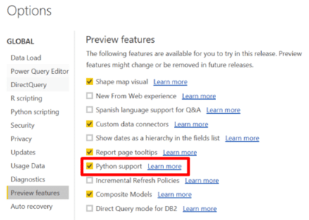
You need to install Python on your computer and install two Python packages (modules) called “Pandas” and “Matplotlib.” These packages are programs that work on Python and allow us to use functions when we work on queries and create visuals. In simple terms, Pandas is for editing queries (datasets) and Matplotlib is for creating visuals. Though we use Matplotlib for this post, there is another package called Seaborn built on top of Matplotlib that provides extended statistical visualization capability. Steps: Installing Python 1. Go to the Python official download site. 2. Download version 3.x or higher for your OS. In this blog, we download Python 3.7.0 and the OS is for Windows.  3. Save the download file in your computer and run “python-3.7.0.exe”. 4. Recommended: In the “Python3.7.0 (32-bit) setup wizard, select “Add Python 3.7 to PATH“. 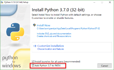 5. Choose Install Now or Customize installation, as you prefer. 6. Follow the dialog and complete the installation. Steps: Installing Pandas and Matplotlib Packages 1. Click on the Windows Start icon and type “command”. 2. Launch Command Prompt window. 3. In the Prompt window, type “py -m pip install pandas” and hit Enter key.  4. It will take a few minutes to complete. 5. In the Prompt window, type “py -m pip install matplotlib” and hit Enter key.  6. It will take a few minutes to complete. 4. Connect to Data Source from Power BI Desktop Let’s go back to Power BI Desktop and make a data source connection. You can connect to any data source such as Excel, csv files, Access, etc. for your visualizations. For example, you could connect to Dynamics 365 data and public marketing data in Power BI and analyze it all with Python libraries and visualizations. You could associate customers in Dynamics 365 with locations from the marketing data to see trends of real estate development and predict the development area over time and sales on household items. In this blog, we will keep it simple and connect to a Dynamics 365 for Sales online free trial and use the Accounts and Opportunities sample data for visualization. Steps: Connecting to Dynamics 365 for Sales trial 1. In Power BI Desktop, connect to Dynamics 365 Online. Please refer to the blog post: How to Connect to Dynamics 365 Data from Power BI Desktop (Note: The current Dynamics 365 Customer Engagement Web API version is 9.0) 2. Load the accounts and opportunities tables. 3. Power BI Desktop should automatically create one-to-many relationships between the Accounts and Opportunities tables.  5. Creating “My First” Python visual We are going to create a Python column chart “Opportunity Estimates by City.” We take the city data from the Accounts table and the opportunity estimates from the Opportunities table. Steps: Creating “My First” Python Column Chart 1. Go to Visualizations and select “Py” chart icon. Enable script visuals if necessary. 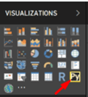 2. A Python blank visual appears on the canvas and the Python script editor appears below. 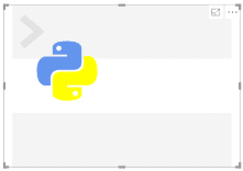  3. Let’s drag and drop the city and the estimatedvalue fields to the “Values” section (Hint: Use the Search box to find fields. You can also limit which fields are available using the Choose Columns command in the query editor.)  4. Once the fields are set, Python performs the following tasks by default as shown in the Python script editor:
 5. Now we need to write a script to create a visual with Python. We’ll start with the minimum required steps and see what the column chart looks like by default. For each step below, write or copy and paste the code in bold into the Python script editor.
 The following Python column chart is created! 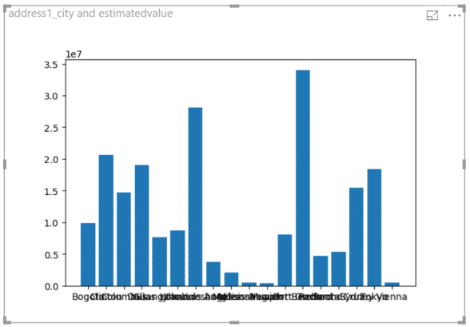 7. We can use some Power BI chart format properties. In this case we hide the title “address1_city and estimatedvalue” in the column chart 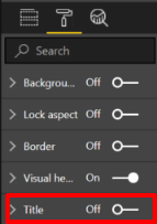 8. We can update the chart to change color, formatting, labels and layout by modifying the script. *Note: script changes and additions are in bold below # libraries: import matplotlib.pyplot as plt # define fields: x = dataset.address1_city y = dataset.estimatedvalue # define visual: plt.bar(x,y, color=[‘navy’]) # format properties: plt.xlabel(‘City’, fontweight=’bold’, fontsize=’10’) plt.ylabel(‘Estimates ($M)’, fontweight=’bold’, fontsize=’10’) plt.title(‘Estimates by City’, fontweight=’bold’, fontsize=’12’) # rotate the x label to 80 degrees plt.xticks(color=’black’, rotation=80) plt.yticks(color=’blue’) # custom layout plt.subplots_adjust(bottom=0.3, top=0.9) # show result plt.show()  9. You can add other Power BI visuals to the report page in addition to the Python visual.  You created “My First” Python column chart. Creating visuals with Python gives us a different look and feel from the Power BI charts, maybe a more scientific look! These Power BI blogs provide more information about the new Python capabilities: The following list are the official links regarding Python and the packages discussed in this blog. Power BI is not a full development environment. For the best experience debugging and working with Python script, we recommend using an integrated development environment such as Visual Studio Code. The data science platform Anaconda Distribution is an integrated way to install and manage Python as well as packages and environments. Learn more about Python visuals from examples at the Python Graph Gallery. For more examples of using Power BI to analyze data from Dynamics 365 for Sales or Customer Service, go to Connect Your CRM Online Data to Power BI for Powerful Analysis. Happy Power BI Python-ing! Источник: https://www.powerobjects.com/2018/10...er-bi-desktop/
__________________
Расскажите о новых и интересных блогах по Microsoft Dynamics, напишите личное сообщение администратору. |
|
|
|
|
|